Funnily enough, I find icons an improvement overall - even if those are inconsistent, it feels like it gives me more points to anchor my eyes on when skimming through an unknown menu and gives me any context.
Starting to use Mac ~3 years ago, I often encountered giant blocks of text in right-click menus and while pleasing aesthetically, those were a chore to actually parse. For someone who daily drives macOS for, I assume, multiple years more than me, it probably comes down to memorisation, and how it looks becomes more important (with Tahoe breaking habits), but I find the inconsistencies and icons something that actually helps me find my ground.
Granted, the execution leaves a lot to be improved, I won't argue against it. Tahoe in some places feels downright amateurish. Despite that, I'll still take what Tahoe added over no icons at all... I feel like color icons + using them more sparingly would certainly be better though.
I guess a justification for Tahoe icons on my end is - those help me navigate the UI despite all their shortcomings (and ugliness they bring in many places).
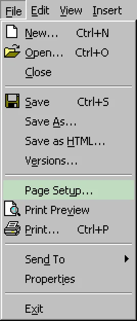
It’s best when only some of the items in a menu (like maybe a third of them) have icons, preferably the most important commands. This gives the menus a visual structure and can also help in better recognizing groups of related items.
I agree, that would be ideal, mentioned that above (so used sparingly + colors is what I would love to see). The linked example I saw in the article is what I had in mind and agree with it being the best way to go.
Though even the visual clutter of everything having icons I find faster to scan with my eyes on the first "visit", as those usually suggest the functionality I might be looking for at least. Even if not perfectly distinct, I find iconography faster to parse and guide me towards what I seek. I don't even particularly mind reused ones, as those usually mark a "section" of their own.
However I understand that some people would probably take no icons at all rather than every option having one... or whatever Apple decided to do in a given menu, considering Tahoe's inconsistency all over the place).
Starting to use Mac ~3 years ago, I often encountered giant blocks of text in right-click menus and while pleasing aesthetically, those were a chore to actually parse. For someone who daily drives macOS for, I assume, multiple years more than me, it probably comes down to memorisation, and how it looks becomes more important (with Tahoe breaking habits), but I find the inconsistencies and icons something that actually helps me find my ground.
Granted, the execution leaves a lot to be improved, I won't argue against it. Tahoe in some places feels downright amateurish. Despite that, I'll still take what Tahoe added over no icons at all... I feel like color icons + using them more sparingly would certainly be better though.
I guess a justification for Tahoe icons on my end is - those help me navigate the UI despite all their shortcomings (and ugliness they bring in many places).